Kit Reveal 2025: More Than Colours, It’s Our Identity
The air is buzzing with excitement at Mumbai Knights FC! As we gear up for an action-packed season across both our senior club and thriving academy, we’re thrilled to officially unveil our stunning new home and away kits. More than just uniforms, these kits represent our club’s evolving identity, dedication to growth, and the vibrant spirit of every player who wears our crest.
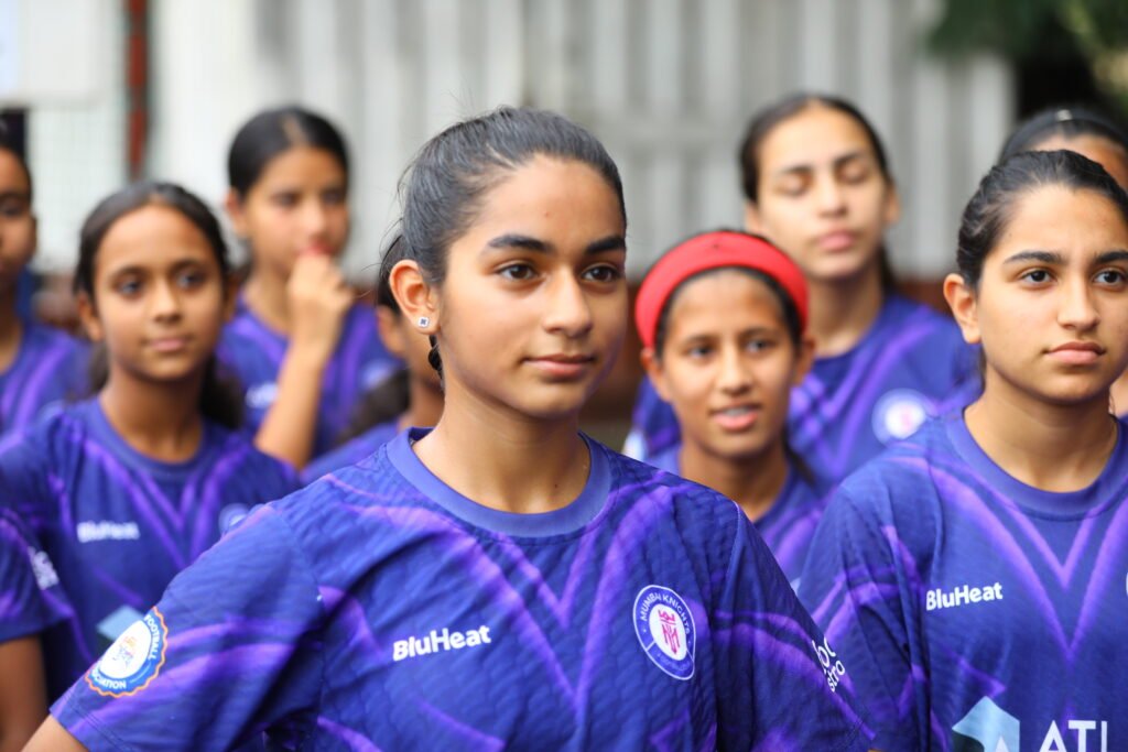
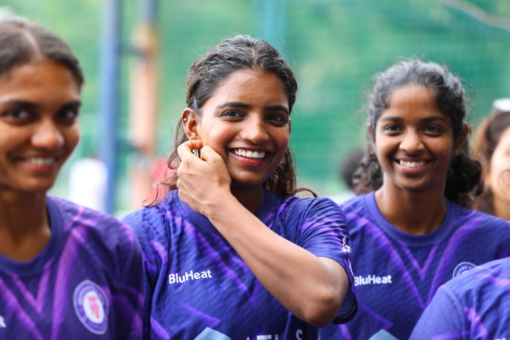
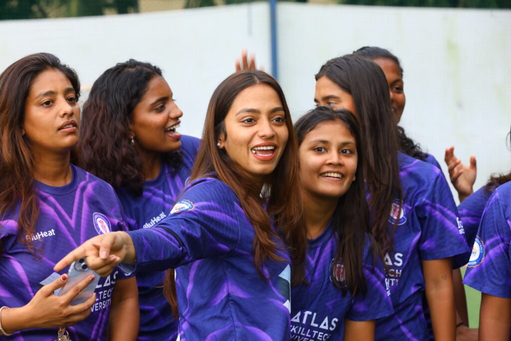
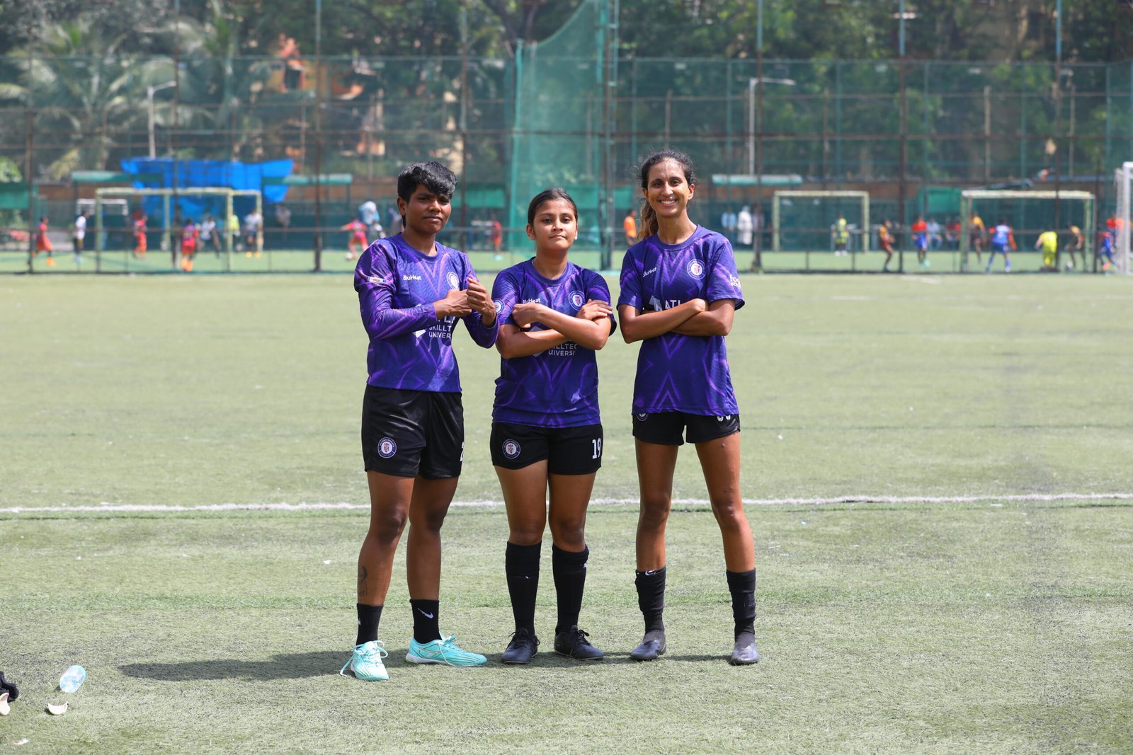
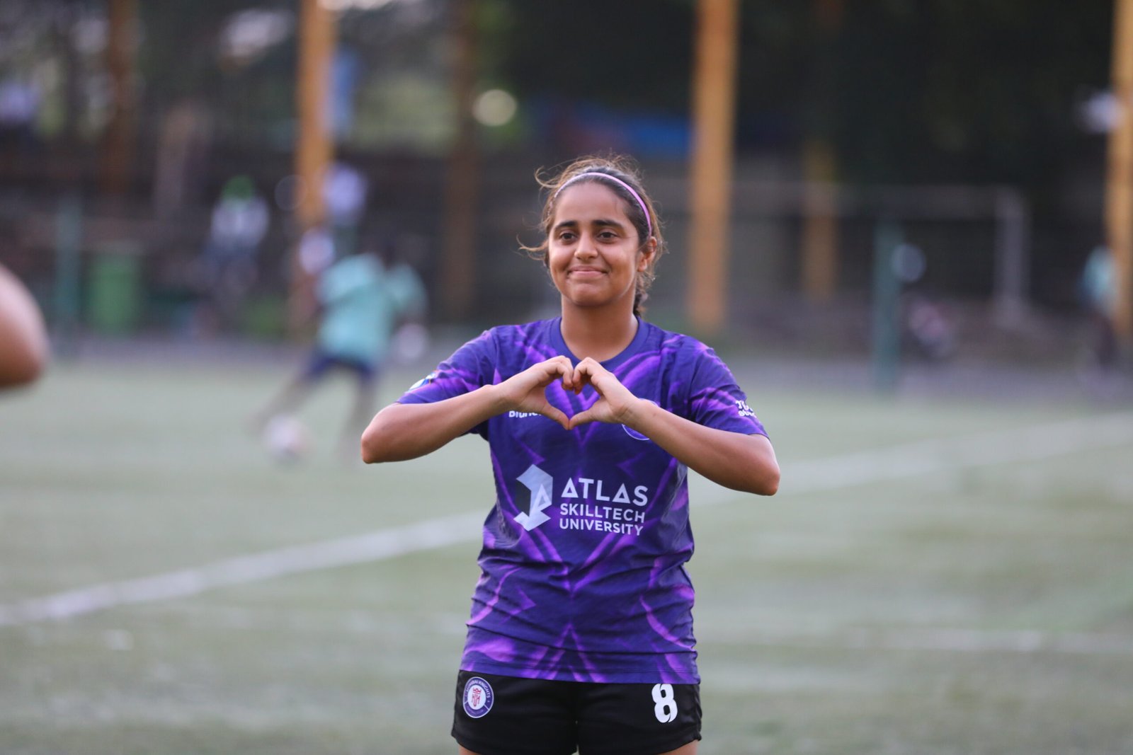
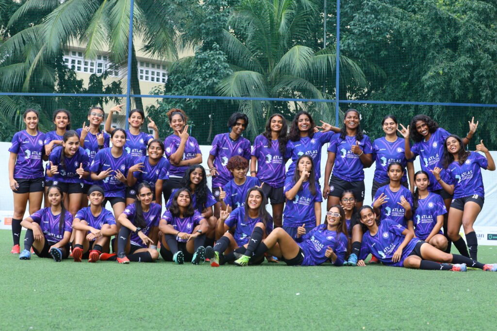
The Aesthetics: Purple Reign, Pink Power
This season, our players will take to the field in a fresh, dynamic style that truly embodies the Mumbai Knights’ ethos.
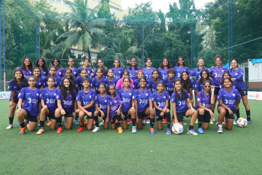
The Home Kit: Our cherished home uniform maintains a dominant, regal purple, a color synonymous with power, ambition, and unity. The design is sleek, modern, and built for high performance.
The Away Kit: Complementing our classic purple, the away kit makes a bold statement with its vibrant pink hue. This striking color choice represents our adventurous spirit, our willingness to challenge, and our determination to stand out wherever we play. It’s a powerful reminder that the Mumbai Knights bring passion and energy to every game, home or away.
Unifying the Brand: The New Crest
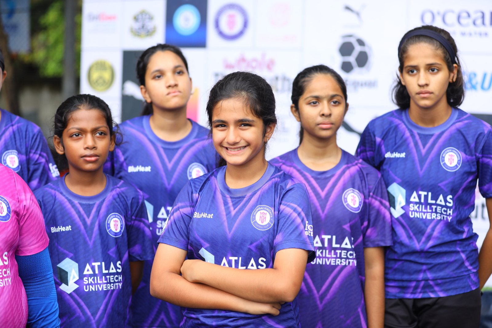
A significant feature of this year’s reveal is the prominent display of our new club logo on both kits. This updated emblem symbolizes our forward momentum and commitment to excellence. We’re incredibly proud to carry our new identity onto the pitch, marking a unified commitment from the club’s management, coaching staff, and every player. We also extend our gratitude to our valued partners and sponsors, whose logos are proudly displayed, reinforcing the strong community and commercial backing that fuels our club’s ambitions.
Beyond the Colors: The Psychology of the Kit
For a player, a high-quality kit does far more than just distinguish them from the opposition—it plays a vital role in their performance and mindset.
Club Identity and Pride: When the senior players wear this uniform, they carry the full weight of the club’s history and future on their shoulders. A well-designed, sharp uniform boosts team morale and projects professionalism and strength to opponents and fans alike. It is the visual representation of the Mumbai Knights fighting spirit.
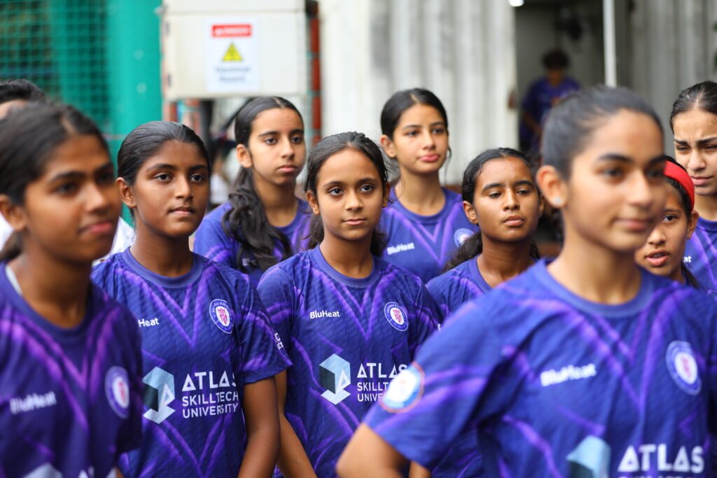
A Symbol of Belonging: For the young members of our academy, pulling on the official Mumbai Knights jersey for the first time is a moment of profound pride. It instills a sense of belonging and commitment, signaling that they are now part of a larger family with a shared mission. This psychological boost is invaluable for young players developing their confidence.
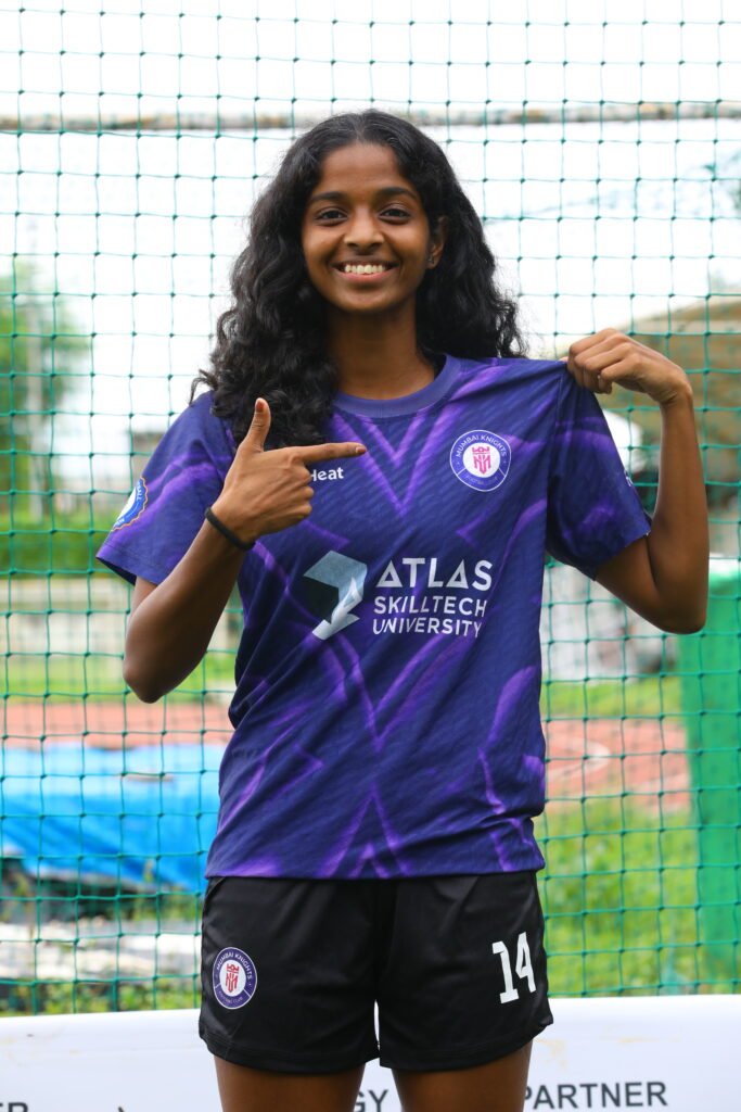
Performance Advantage: These kits are engineered with the modern athlete in mind. The materials are lightweight, breathable, and designed to wick away moisture, helping to regulate body temperature and minimize distraction under pressure. This focus on advanced performance technology ensures that our players can focus entirely on the match, maximizing their agility and endurance during those critical late-game moments.
The new kit is outstanding. It’s a statement of our intent for the season. We look professional, we feel powerful, and we are ready to fight for the badge. Simple as that. Says Head Coach, Preetam

For Club and Academy – United in Purpose
What makes this reveal even more special is that these fantastic new kits will be worn by all members of the Mumbai Knights family. From the senior women’s and men’s teams dominating the league to the aspiring young talents developing their skills in our academy, everyone wears the same colors, the same new crest, and shares the same dream. It’s a powerful, visual symbol of our unified vision and shared commitment to fostering football excellence at every level.